|
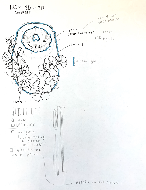
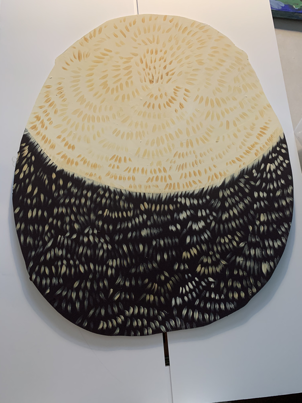
As opposed to last semester, this semester each of the projects built on each other, so there is less preliminary work for the final project because most of the ideas were already worked out in the previous projects. Additionally because it moved so quickly and was generated in Rhino3D, there are even fewer sketches for the final project. This semester's sketchbook served mostly as a way to keep track of feedback and do research instead of working out compositional problems because it was so much easier to observe those aspects digitally.
0 Comments
ExErcising the lineFolded surfaceBuilding massThis is the documentation of the planning process of 8 projects over the course of four months.
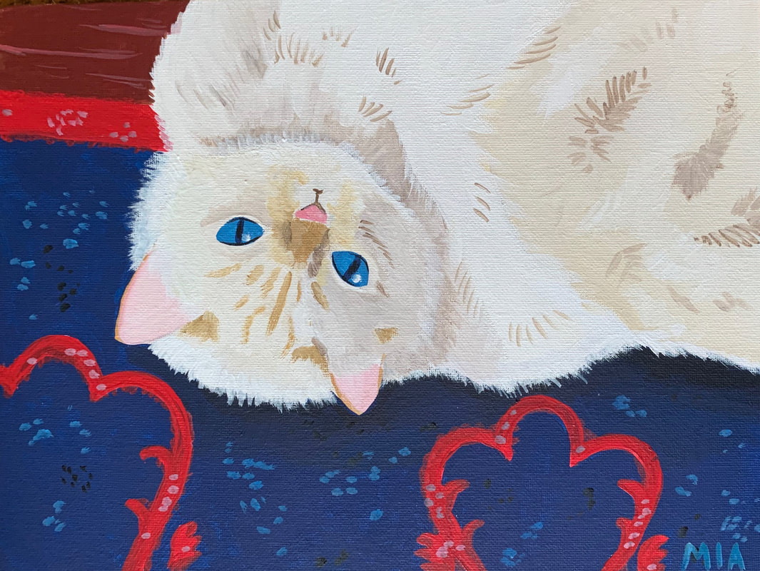
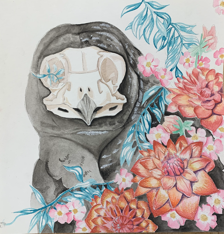
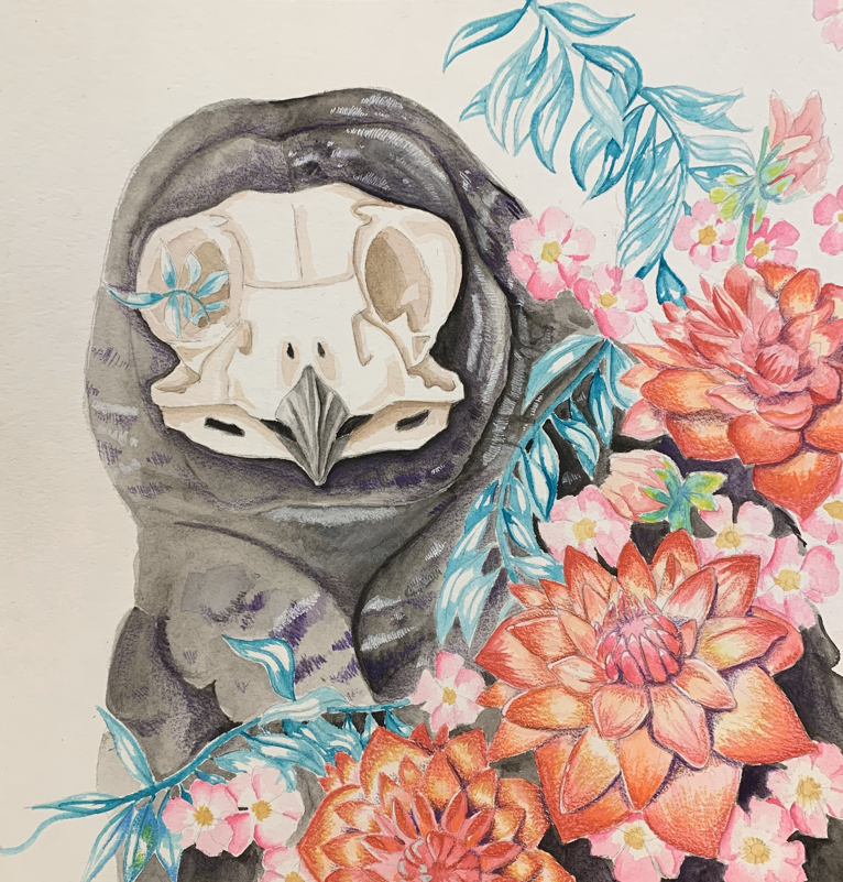
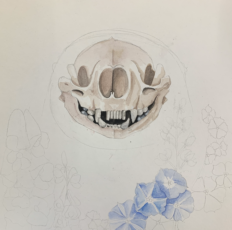
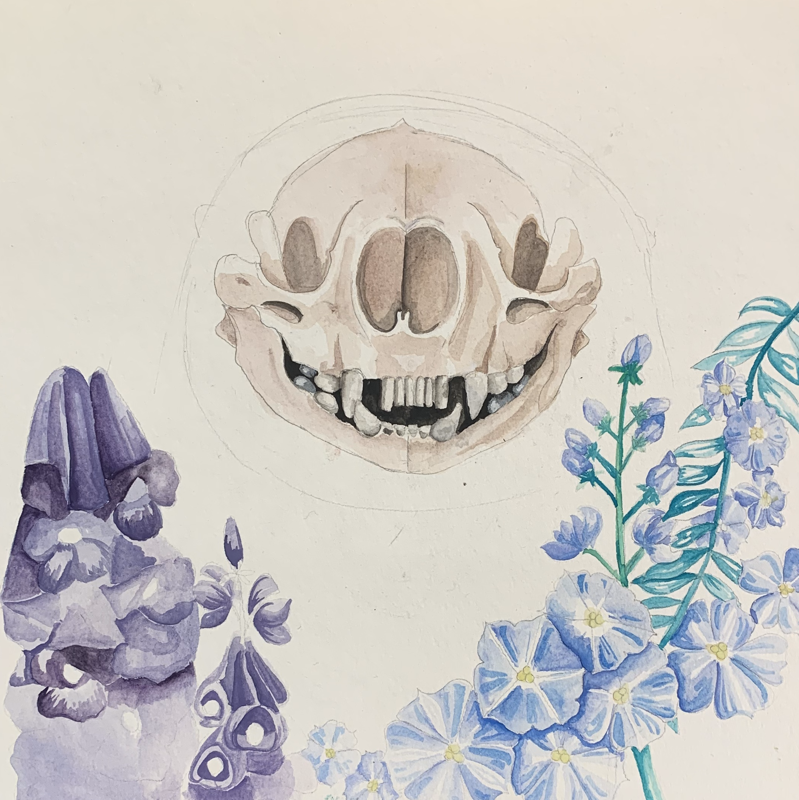
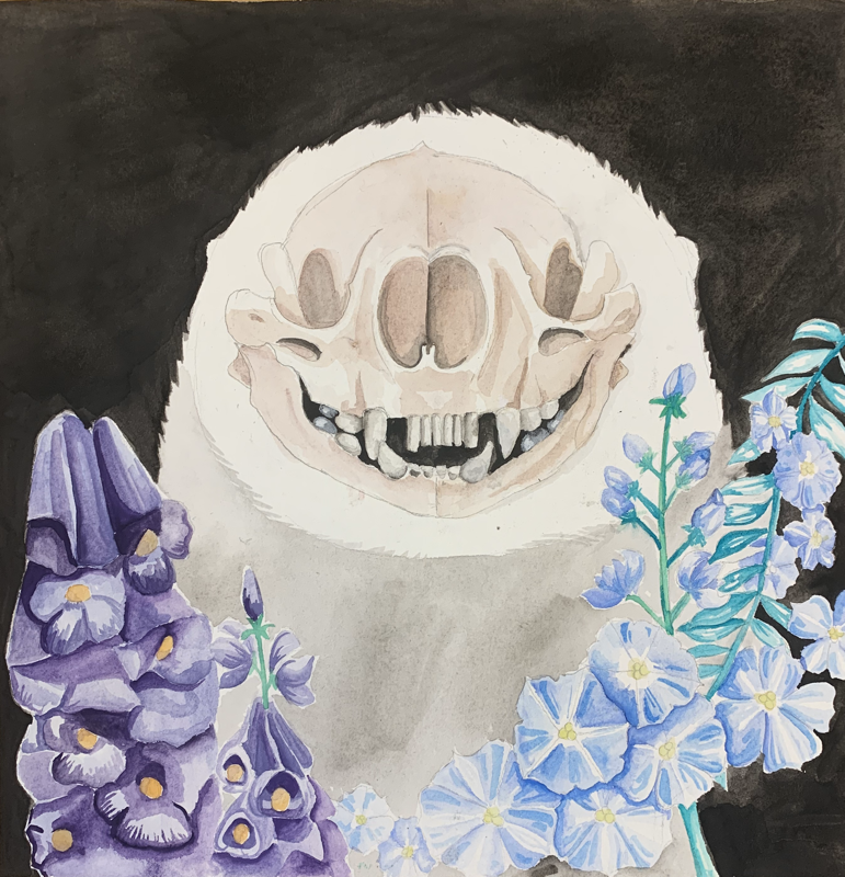
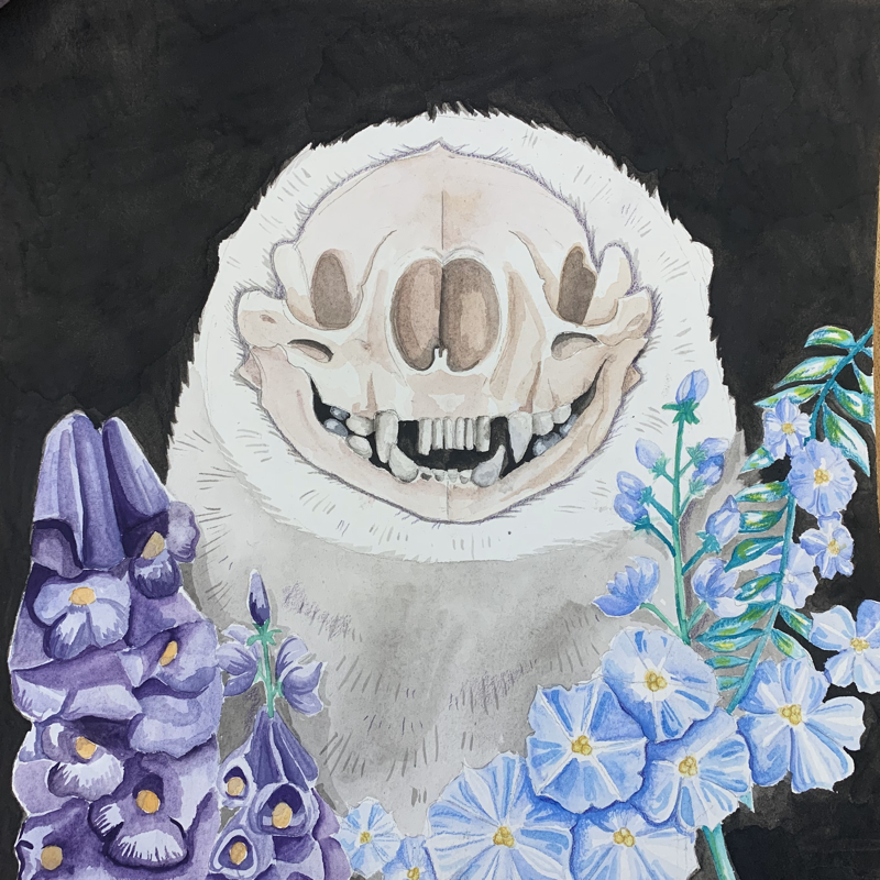
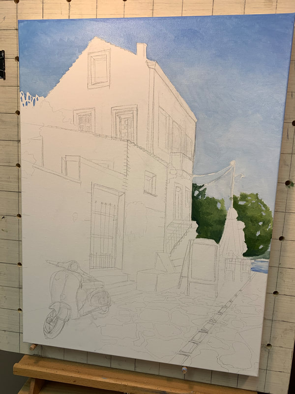
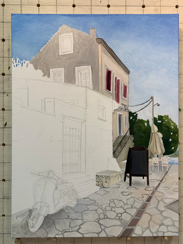
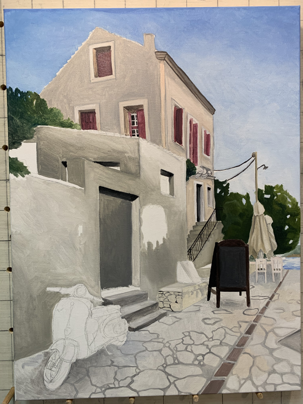
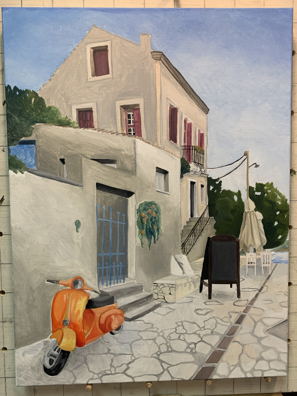
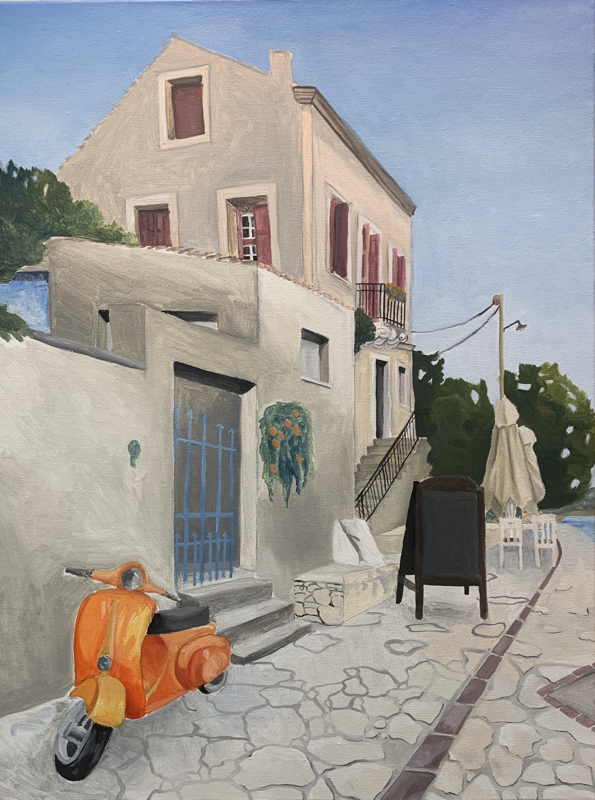
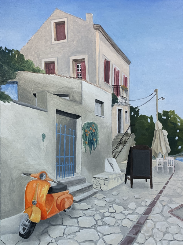
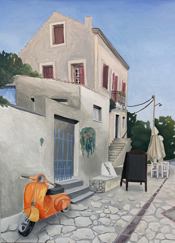
1. Object as Experience 2. Abstraction 3. Blind Contours 4. Change of Scale and Decontextualization 5. Collage 6. Geometry and Fields 7. Proud Prouns 8. Spatial Experience For reference my piece was supposed to be the one with the orange vespa that you can see in the post below this one. However, I was completing it at Midlothian Art Academy. I was unable to pick it up before it closed due to the corona virus. So, I am turning in a painting I did of my mentor's cat as a thanks for dealing with me for the year.
In my art I use a great deal of typography, and the skill and consistency that Jasper Johns wields in his Numbers Series is astounding. It has particularly inspired me to bring more varied colors into my work, and consider the possibility of a more free flowing method. His work has proved to me that the consistency of lettering and quality of work can still be achieved with a looser style, that I had not considered before. By adding this to my repertoire, it would also add texture to the usually flat signs and give any light shapes to bounce off of which could have interesting results. An iconic American artist, Jasper Johns, defined the space between Abstract Expressionism and Pop Art. He employs an interesting mix of scultural paintings and readymade art. He currently continues to work in Sharon, CT.
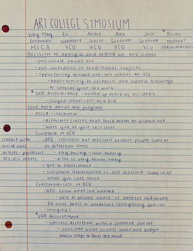
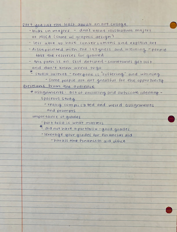
While I did not need to be convinced of going to art school, as I have been already accepted into UVA Architecture early decision, it was nice to get a bit of insight into the program I will be attending. A lot of the reasons Bailey was interested in the program are like mine. I did not want to go into a traditional art major, and enjoyed specifically building in minecraft. The prompt he shared was encouraging even though it was complicated. It seems like there is a great deal of creativity with in the major - something I was concerned about when initially applying. He did not, however, assuage my fears about the work load. It seems some sleepless nights are in my future.
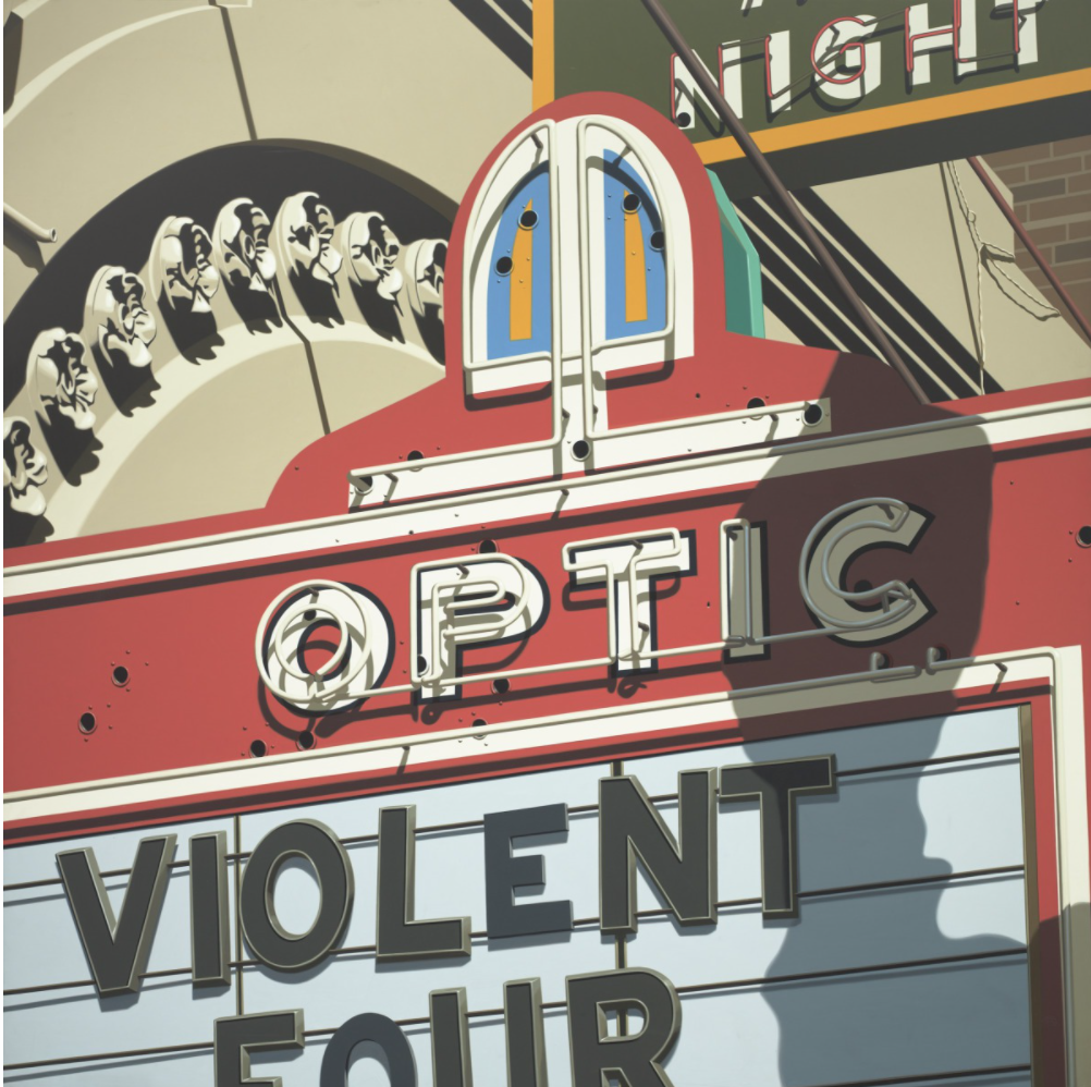
Optic - Robert cottinghamLast week, for the VMFA young at arts program I volunteer for, I explored the Modern and Contemporary Art exhibit. This is a permanent exhibit in the museum, with some pieces rotating. For the program we analyzed pieces with human subjects, specifically people with some familial relationship to one another as an exploration of the idea of family. The children are preschoolers so the discussion about them was not extremely deep, but as we were walking out of the gallery I spotted "Optic" which caught my eye. This piece is very similar to the paintings of neon signs that I have done. There is, however, room for me to grow. There shadows on this piece are dynamic, and it is clear the artist took time in selecting and changing reference to fit his needs. Also along this line the composition is intentional, and avoids the often stagnant, flat feel that neon signs can fall into. Moving forward in my art I hope to apply these concepts for dynamic pieces.
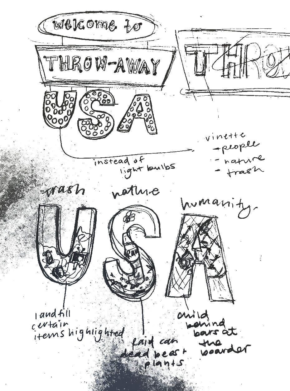
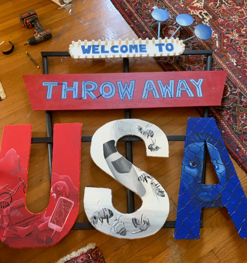 Finishing up this summer project was a race against the clock. There was a lot to do and many things went wrong. painting the lettering was fairly simple, but placing the lights was not. Luckily I figured it out and with some help from my dad I put it all together with a strong base. In order to make it fit in my car the letters "USA" are strongly velcroed on. This does make it unable to lean on the bottom which means during the presentation I will have to securly hang it. Another issue as far as hanging I persieve is the strength of hanger on the wall. For my normal paintings it is sturdy, but I fear that they may not be able to hold up my painting. Because my time was about two weeks short in July and I’m leaving for Greece tomorrow this is as far as I got on painting. Although I’m not completely finished (I plan to finish before tonight) this is the longest most time consuming part because past this point I just need to paint letters and attach the neon and light bulbs. Both of those are things I can get help on unlike the intricate painting of this bottom part that I needed to do on my own. I’m am extremely happy with how far I’ve gotten this month considering the scale and the fact that it is almost like I’m painting 3 projects instead of just one. So far with the way it is pulling together I think it really rounds out my portfolio because it ties in many themes that were prevalent in my artwork. I definitely prefer the “A” and in hindsight think I should have at least on the “U” used one large image instead of many small ones which to me doesn’t have as effective of a composition and doesn’t create as much connection as the last one. I also dislike that with the S the main color (white) cannot be used as a mid tone like it is on the other two which I find more visually pleasing because of that. If I were to do something similar in the future I would definitely choose darker/mid toned colors to be the base instead of something light like white or yellow to maintain the visual effect.
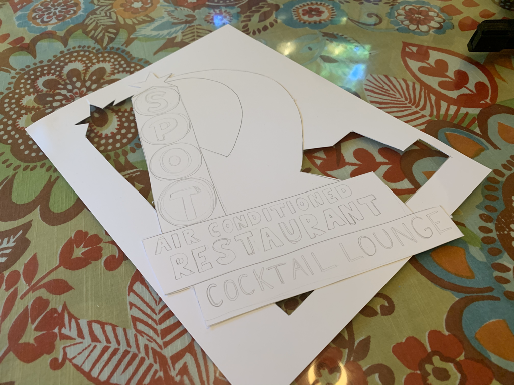
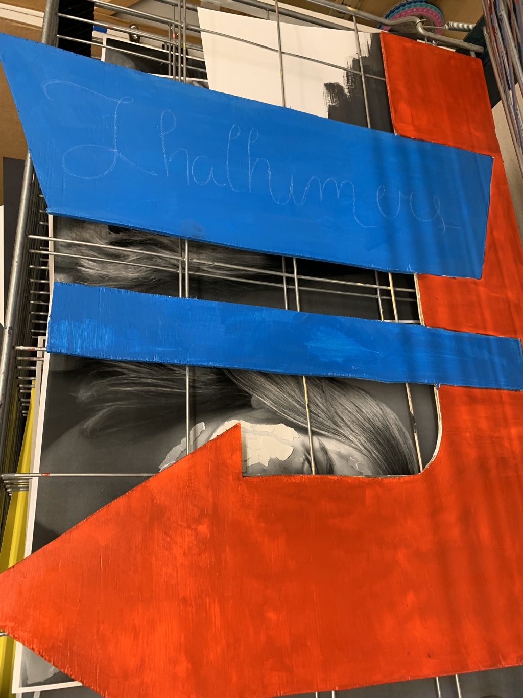
For the last week I went out and bought some plywood and traced out the parts of the sign I wanted. I also cut out some of the parts (the lower USA). I then primed these pieces with gesso put a base coat of color and started painting the A which will eventually be a depiction of one of the children who died in Texas after being separated from her parents. I’ll paint her behind bars to reference the government separating and locking up children in detention centers on the border. This will with the rest of the sign symbolize how the United States is in effect throwing away its humanity.
The idea is to connect my past works of a throw away society into the thing that started this motif - signs.
|
Mia
|
 RSS Feed
